My last post showed half of Perth’s outer urban population growth between 2011 and 2016 happened in places more than 5 km from a train station (see: Are Australian cities sprawling with low-density car-dependent suburbs?). It’s very car-dependent sprawl, with high levels of motor vehicle ownership (96 per 100 persons aged 18-84) and high private transport mode share of journeys to work (88%).
But what about population growth overall in cities? Is most growth happening close to rapid transit stations? How are cities orientated to rapid transit overall? And how does rapid transit orientation relate to mode shares?
Let’s dive into the data to find out.
Why is proximity to rapid transit important?
Public transport journey to work mode shares are generally much higher close to stations:

And motor vehicle ownership rates are generally lower closer to stations:

However it is worth noting that the proximity impact wears off mostly after only a couple of kms. Being 2-5 kms from a station is only useful if you can readily access that station – for example by bus, bicycle, or if you are early enough to get a car park.
Also, proximity to a station does not guarantee lower car dependence – the rapid transit service has to be a competitive option for popular travel destinations. I’ve discussed the differences between cities in more detail
(see: What explains variations in journey to work mode shares between and within Australian cities?), and I’ll a little have more to say on this below.
But in general, if you want to reduce a city’s car dependence, you’ll probably want more people living closer useful rapid public transport.
Is population growth happening near train/busway stations?
The following chart (and most subsequent charts) are built using ABS square kilometre grid population data for the period 2006 to 2018 (see appendix for more details).
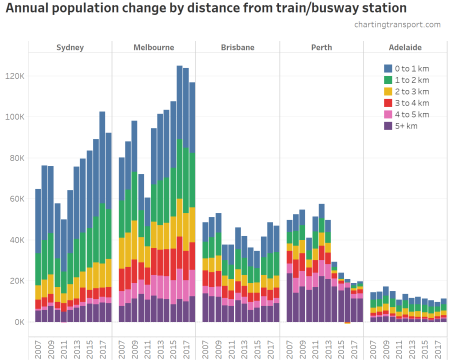
Melbourne has seen the most population growth overall, followed by Sydney and Brisbane. Population growth in Perth has slowed dramatically since 2014, and has been remained slow in Adelaide.
Population growth in areas remote from stations most cities has been relatively steady. By contrast, the amount of population growth nearer to stations fluctuates more between years – there was a noticeable dip in growth near stations around 2010 and 2011 in all cities.
You can also see that in recent years the majority of Perth’s population growth has been more than 5 km from a station.
To show that more clearly, here’s the same data, but as a proportion of total year population growth:
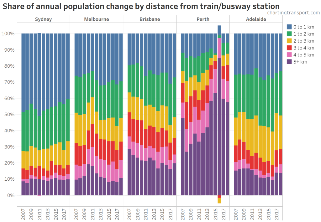
You can see that most of Perth’s population growth has been remote from stations. In the year to June 2016, 85% of Perth’s population growth was more than 5 km from a train station (the chart actually goes outside the 0-100% range in 2016 because there was a net decline in population for areas between 2 and 4 km from stations). That was an extreme year, but in 2018 the proportion of population growth beyond 5 km from a station had only come down to 57.5%. That is not a recipe for reducing car dependence.
At the other end of the spectrum, almost half of Sydney’s population growth has been within 1 km of a train or busway station. No wonder patronage on Sydney’s train network is growing fast.
Melbourne has had the smallest share of population growth being more than 5 km from a station over most years since 2006. The impact of the South Morang to Mernda train line extension, which opened in August 2018, won’t be evident until the year to June 2019 data is released (probably in March 2020). Melbourne’s planned outer growth corridors are now largely aligned with the rail network, so I would expect to see less purple in upcoming years.
Here’s the same data for the next largest cities that have rapid transit:
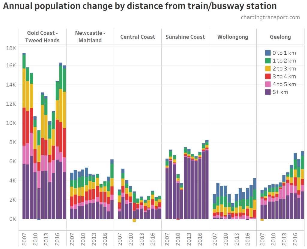
Gold Coast – Tweed Heads has seen the most population growth, followed by the Sunshine Coast and more recently Geelong population growth has accelerated.
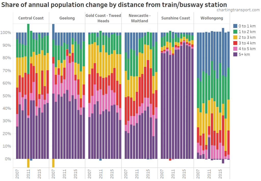
The Sunshine Coast stands out as having the most population growth remote from rapid transit (a Maroochydore line has been proposed), while Wollongong had the highest share of population growth near stations.
What about total city population?
The above analysis showed distances from stations for population growth, here’s how it looks for the total population of the larger cities:
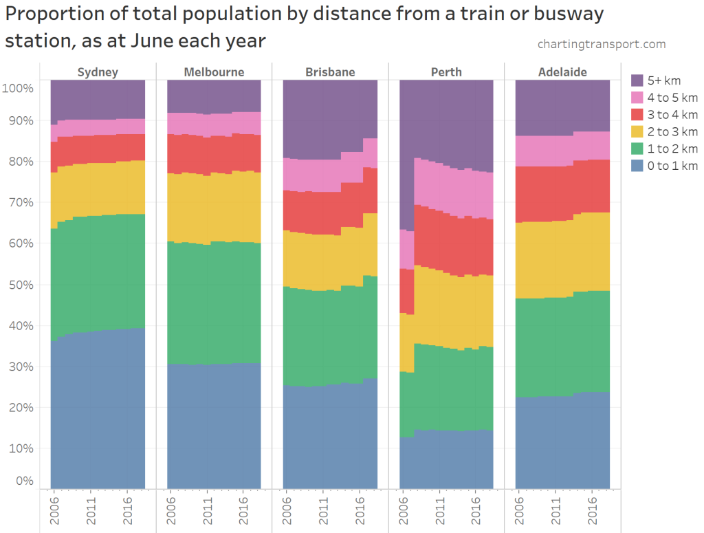
Sydney has the most rapid transit orientated population, with 67% of residents within 2 km of a rapid transit station. Sydney is followed by Melbourne, Brisbane, Adelaide, and then Perth.
The most spectacular step change was in Perth in 2008, following the opening of the Mandurah rail line in the southern suburbs. This brought rail access significantly closer for around 18% of the city’s population. However, Perth has since been sprawling significantly in areas remote from rail while infill growth has all but dried up in recent years. 22% of the June 2018 population was more than 5 km from a train station, up from 19% in 2008. But it’s still much lower than 37% in 2007. Perth remains the least rapid transit orientated large city in Australia.
Brisbane has also seen some big step changes with new rail lines to Springfield (opening December 2013) and Redcliffe Peninsula (opening October 2016).
Several new station openings around Melbourne have kept the overall distance split fairly stable – that is to say the new stations have been just keeping up with population growth. The biggest noticeable step change was the opening of Tarneit and Wyndham Vale stations in 2015.
Adelaide’s noticeable step change followed the Seaford rail extension which opened in February 2014.
Sydney’s step change in 2007 was the opening of the North West T-Way (busway). The opening the Leppington rail extension in 2015 is also responsible for a tiny step (much of the area around Leppington is yet to be developed).
Here are the medium sized cities:
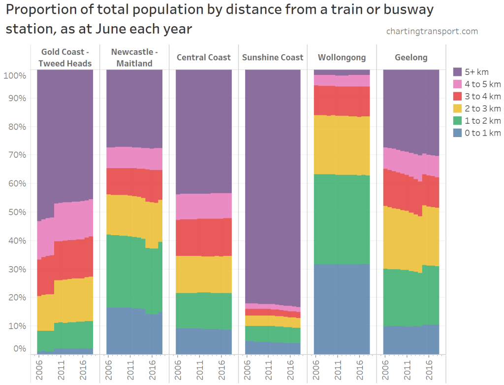
Woolongong is the most rapid transit orientated medium sized city, followed by Geelong and Newcastle.
In the charts you can see the impact of the Gold Coast train line extension to Varsity Lakes in 2009, the truncation of the Newcastle train line in 2014 and subsequent opening of “Newcastle Interchange” in 2017, and the opening of Waurn Ponds station in Geelong in 2015.
Average resident distance from a rapid transit station
Here’s a single metric that can be calculated for each city and year:
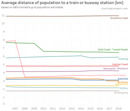
Many cities have barely changed on this metric (including Melbourne which has had a reduction of just 26 metres between 2006 and 2018). Brisbane, Perth and the Gold Coast are the only cities to have achieved significant reductions over the period.
It will be interesting to see how this changes with new rail extensions in future (eg MetroNet in Perth), and I’ll try to update this post each year.
How strong is the relationship with public transport mode shares at a city level?
Here is a comparison between average population distance from a train/busway station, and public transport mode share of journeys to work, using 2016 census data:
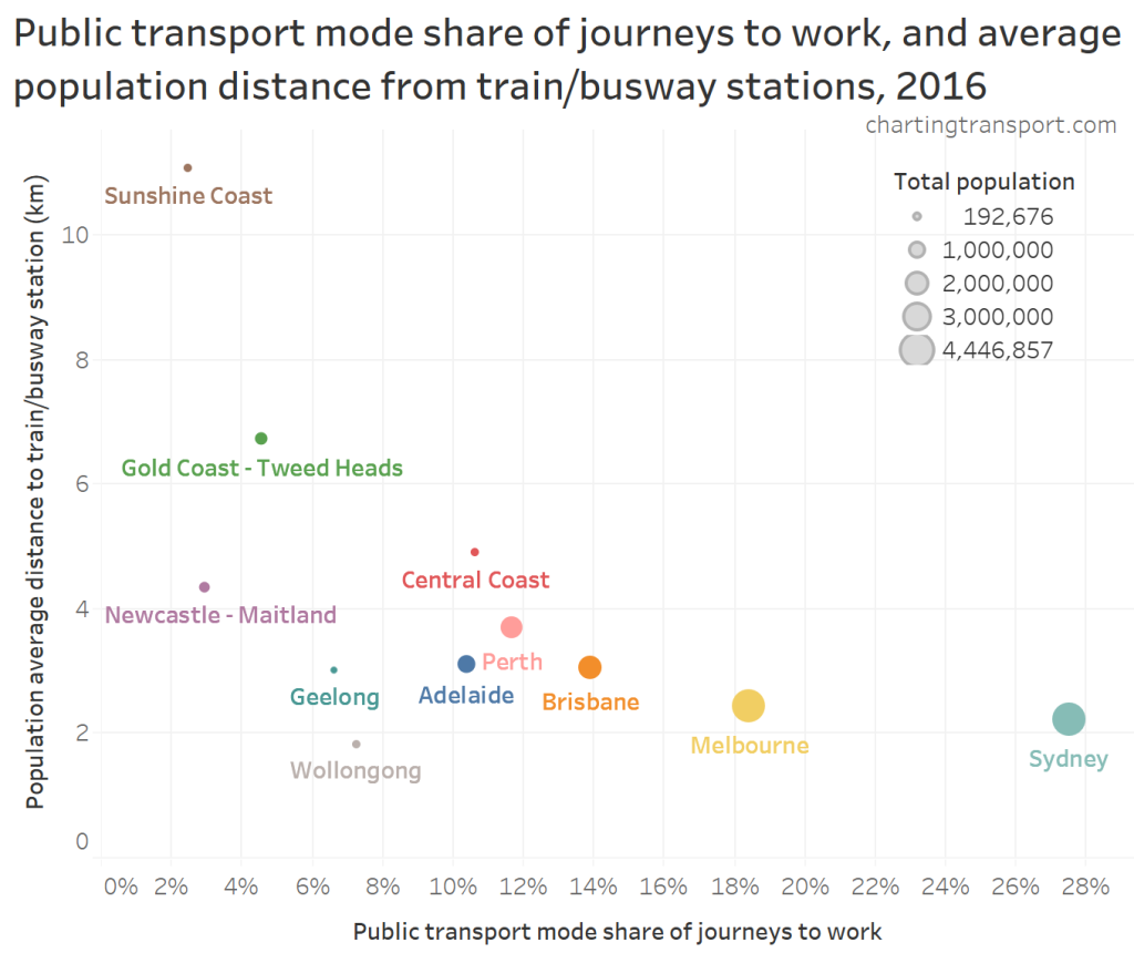
While there appears to be something of an inverse relationship (as you might expect), there are plenty of other factors at play (see: What explains variations in journey to work mode shares between and within Australian cities?).
In particular, Newcastle, Geelong, and Wollongong have relatively low public transport mode shares even though they have high average proximity to rapid transit stations.
Most journeys to work involving train from these smaller cities are not to local workplaces but to the nearby capital city, and those long distance commutes make up a relatively small proportion of journeys to work.
Here are some headline figures showing trains have minimal mode share for local journeys to work in the smaller cities:
| City | Train mode share for intra-city journeys to work |
Train mode share for all journeys to work |
| Gold Coast | 0.6% | 2.2% |
| Sunshine Coast | 0.1% | 0.8% |
| Newcastle | 0.5% | 1.0% |
| Wollongong | 1.2% | 4.9% |
| Central Coast | 1.2% | 9.3% |
| Geelong | 0.5% | 4.5% |
Appendix: About the data
I’ve used ABS’s relatively new kilometre grid annual population estimatesavailable for each year from June 2006 onwards (to 2018 at the time of writing), which provides the highest resolution annual population data, without the measurement problems caused by sometimes irregularly shaped and inconsistently sized SA2s.
I’ve used train and busway station location data from various sources (mostly GTFS feeds – thanks for the open data) and used Wikipedia to source the opening dates of stations (that were not yet open in June 2006). I’ve mostly ignored the few station closures as they are often replaced by new stations nearby (eg Keswick replaced by Adelaide Showgrounds), with the exception of the stations in central Newcastle.
As with previous analysis, I’ve only included busways that are almost entirely segregated from other traffic.
I haven’t included Gold Coast light rail on account of its average speed being only 27 km/h (most Australian suburban railways average at least 32 km/h). I have to draw the line somewhere!
I also haven’t included Canberra as it lacks an internal rapid transit system (light rail is coming soon, although it will have an average speed of 30 km/h – is that “rapid transit”?).
Distances from stations are measured from the centroid of the grid squares to the station points (as supplied) – which I have segmented into 1 kilometre intervals. Obviously this isn’t perfect but I’m assuming the rounding issues don’t introduce overall bias.
Here’s what the Melbourne grid data looks like over time. If you watch carefully you can see how the colours change as new train stations open over time in the outer suburbs:
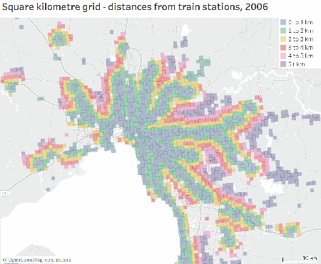
On this map, I’ve filtered for grid squares that have an estimated population of at least 100 (note: sometimes the imperfections of the ABS estimates mean grid squares get depopulated some years).
Finally, I’ve used Significant Urban Areas on 2016 boundaries to define my cities, expect that I’ve bundled Yanchep into Perth, and Melton into Melbourne.